
Citizen’s 67-9011 Challenge Timer – usually known as the ‘Bullhead’ – is the most commonly seen version of their line of vintage auto chronographs. I’ve had more than a few people ask me to take a look at examples offered for sale, typically on eBay, to check whether they are original or not. I have published a page on this issue before ( https://sweep-hand.org/want-an-original-citizen-bullhead-a-quick-buying-guide/ ) , but I thought I’d add some more information, specifically about dials. Beyond the obvious point about non-original colours, it can be difficult to see other issues, so I hope to cover them here – I’ll also add this to the reference page. Of course some sellers describe after market parts, others don’t – maybe they bought the piece themselves believing to to be all original – so I hope these additional pointers will help.
I am using pics of my own example, which has the patina and wear you’d expect of a well-used nearly forty year old watch, but the condition of it clearly shows what to look for, at least for this, the most commonly seen model which has the dial code ‘901018‘. But first here is an example of an aftermarket dial, to help with the comparisons that need to be made (image from the internet, with due acknowledgement – or maybe apologies! – to the owner). This example is quite a poor copy, which makes it easier to see the differences:

And mine:

The hour markers are painted white with a black edges and a lume spot at the outer end. Note how the ones on the blue dial have uneven edges and the lume spots are off centre.
Generally the printed letters and numbers are of a fine quality. The font used for the letters has been created by Citizen – later pics make this clearer still. It has a small ‘serif’, unlike the blue dial, and differences can be seen in shaping and detail – see, for example the ‘C’ and ‘G’.
The ‘C’ of ‘CHRONOGRAPH’ is positioned centrally under the ‘C’ of the applied CITIZEN’ logo, not to the left as in the after market example. On an original dial the ‘H’ at the end is aligned with the vertical end part of the “N’ on the applied dial.
The minute/second track is worth looking at closely – first the ‘TACHYMETER’ and position of the ‘500’ mark:
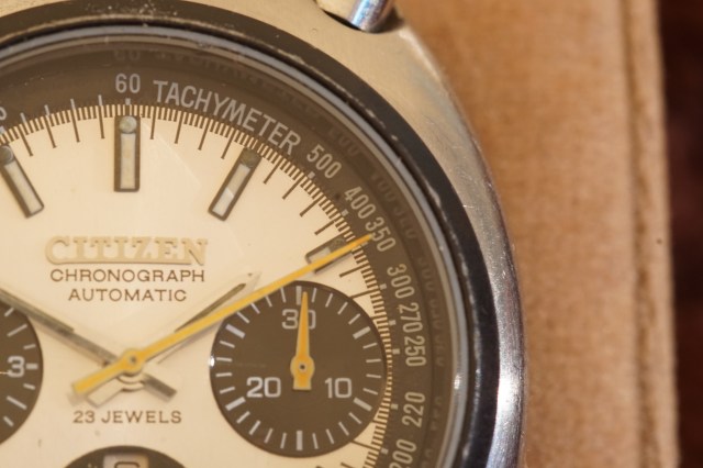
On the blue dial ‘TACHYMETER’ appears taller and a little compressed in its spacing, and the 500 mark is placed to the right of the 7 minute and 1 second line – the original sits on the marker, but slightly to the left (this also applies the dial of 67-9356 octagonal all-steel model). The minute and second markers also touch the black tachy ring – there is a clear space on the blue dial. On the blue dial the white marks under the numbers are badly placed and overlap the edge of the black tachy ring and the main dial from about ‘250’ to ‘110’.
Printing of the dial code is positioned as follows:

The ‘9’ is placed in line with the 24th minute marker and the code ends well before the 21st minute marker. The blue dial replicates this reasonably well. The detail of the font can be seen here on ’23 JEWELS’. Next, note that ‘JAPAN 8110’ starts in line with the 39th minute marker and ends in line with the 36th minute marker:

Also, note the fineness of the printing, and particularly here how the tachy numbers are positioned – incorrectly on the blue dial, for example note how the ‘1’ in ‘100’ and the ‘5’ in ’95’ relate to the white indices which start at ‘100’.
There is no gap between the edge of the sub-dials and the minute/second track – there is such a gap on the blue dial, at least on this side of the dial! On the other side of the blue example the track actually overlaps the sub-dial slightly:

Again, note the detail of the font – it is a rather nice design 🙂
Finally, the sub-dials. These have a subtly grooved finish, rather like a tiny vinyl record (remember them? 🙂 ). Often after-market dials are too coarsely finished, although it looks like no attempt was made to replicate it at all on the blue dial. Also, the numbers do not touch the white indices:

Happy hunting!


Thanks Stephen, the original article lacked some of these details. I always wondered about my dial, and happy to report that after close inspection it looks exactly like yours. 🙂
You’re welcome Tom – good to hear that yours is an original 🙂 I haven’t added this to the reference page yet, since there are some things I can add about one or two other dials in the bullhead range. Hopefully I can do that in the next few days. Stephen
Excellent article Stephen! I should also mention that I’ve seen “aftermarket” dials for the blue 9038 on some watches although I’ve never seen any for sale. Have you come across any?
Hi Jay, thanks for your kind comment. I have seen aftermarket 67-9038 dials, both blue and black. I know about the black one, because I have one! Stephen
Great add-on to an already great article. I bought my 67-9020 GPB after reading your article a year ago, and it checks all the boxes.
I wish vintage Citizens were a bit more available… don’t see many of these in good condition.
Thanks 🙂 Good to hear that your 67-9020 is a good example. They are indeed hard to find in good condition. Stephen
Why is CITIZEN sign applied on both? I have original dial and it is painted NOT applied. I think both dials are aftermarket.
sorry, the right link for second is :
2) https://www.ebay.it/itm/CITIZEN-BULLHEAD-CHRONOGRAPH-GOLD-8110A-PANDA-GOLDEN-TONE-DIAL-BRAD-PITT/163982830787?ssPageName=STRK%3AMEBIDX%3AIT&_trksid=p2060353.m1438.l2649